This article is by Susan P. Wyche, Kelly E. Caine, Benjamin K. Davison, Shwetak N. Patel,
Michael Arteaga, and Rebecca E. Grinter from Georgia Tech.
Since people are using computers to help with religious and spiritual practices, designers need to learn to design for these faith-related purposes. The authors of this paper present a design for mobile phones that help Islamic practices.
Design information for faith-related purposes is hard to come by, but people use computers for such purposes. For example, Muslims, have to pray 5 times a day. Certainly a phone application to help remind them would be useful, although if they pray 5 times a day, they should be used to it. They use some applications such as camera phones already to take pictures of shrines when they visit and they pray to the pictures. Meanwhile, Christians use applications to help them learn new Bible verses.
There are about 2.3 million Muslims in the US, and the religion is growing. They've always used compasses to determine the location of Mecca, and sun-dials to see what time it was so that they might pray at the right time. About 15 minutes before it's time to pray, they begin by washing themselves and other rituals. In Muslim countries, television stations halt broadcasts during these times. Finally, it's where the sun is at that tells EXACTLY when to pray.
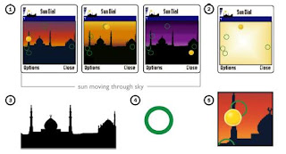
This program helps the users see where the sun is to pinpoint when they should get ready to perform their rituals and pray. And to mimic nature, the sky changes colors as the sun moves across the sky. And there are sillouettes of mosques in the background so that users get a feeling for religion. It helps them reflect on their faith. This imagery is much better suited for it's use than a simple beep for an alarm which lets Muslims know when it's time to pray. The imagery helps them reflect on their faith and feel more natural than an alarm telling them to pray.
There are many other religions which could benefit such as Christians using a crucifix on their screen to help them remember to be thankful for the sacrifice that Christ made. This is in the future works hopefully.
Tuesday, April 28, 2009
Tuesday, April 14, 2009
Shadow Reaching: A New Perspective on Interaction for Large Wall Displays
This article is by Garth Shoemaker, Anthony Tang, and Kellogg S. Booth.
Basically, the article is about shadow recognition and stretching which we call "reaching". By using technology called 6DOF, it can actually detect where a shadow is. Another technology used is similar to Magic Lenses. The magic lens was a lens one would hold over an image or picture to get another image back. For example, if someone holds a lens over a map, it may show pictures from that area. If I held a magic lens over a map of the world and held it over New York, I could expect to see the Statue of Liberty. If I held it over Paris, I could expect to see the Eiffel Tower.
The first application, however, is similar to touch-screen technology. The user holds a tracker or marker that will allow them to interact with the screen. So if they hold it in their hand, the tracker (the green button below) will be what is grabbed. Wherever the item is on the shadow is where the marker is on the screen. This is useful so that the rest of their shadow doesn't mess anything up. In the image below, it uses this shadow to allow the user to drag and drop items on the screen.
You can see the user putting a puzzle together. This is helped by the fact that the user can stretch or "reach" their shadow by either altering the light source or by moving closer towards the light source and away from the projection. This is extremely useful for larger images where the user can move closer to the light and gain the ability to stretch and reach to the top.
Similarly, the second application uses full-body shadows and not only a few points which are marked by markers. For example, the paper spoke of a program where balls are bouncing on a screen and if they hit the shadow, they will bounce off and away.
The third application is more similar to the Magic Lenses. As you can see in the picture below, the two girls cast shadows on a map to give a satellite view of the map whereas the rest is just a normal view of the map.
This is a neat application that is very similar to the Magic Lens. In the future, they are hoping to alter the light source to make other applications possible. They also plan to test and see how shadow reaching and recognition compares to other methods of giving presentations.
Saturday, March 28, 2009
Emotional Design
Don Norman strikes again. Yet ANOTHER book about design, this one design that deals with human emotions. What he said in the book made a lot of sense, but directly goes against some of the stuff he said in his previous works: The Design of Everyday Things and The Design of Future Things. He talked about how design plays on emotions, what emotions are good, what are bad, and what are bad that can be used in a good way which I thought was neat. For example, if it frustrates the user, they will become much more aware of what they are doing and working with.
Thursday, March 26, 2009
The Man Who Shocked the World
This book bored me, but the results were very interesting. I always wondered how Nazi soldiers were able to torment and kill people, but now it's not surprising when people can shock the heck out of someone just because they get a word wrong. So think of if they have it drilled into their head that Jews, gypsies, etc. are lower life form, and they have no remorse killing these people. The experiments were well-thought out and fun to read, but some of the material was drawn out and unnecessary, such as the stuff about his personal life, his death, getting money for research, etc. I enjoyed hearing what conclusions he came to because it explained a lot about behavior.
I also agreed with it being hard to ask someone to give up a seat. I've never done it before, but asking simple favors from friends such as, "Can I borrow that book?" is hard for me to ask. I can't imagine asking a stranger to give up their seat. And I won't lie... If I found a letter addressed to Liberal Youth, I wouldn't deliver it like I would to the Republican Party. The book was historical and interesting, but had a little fluff. I enjoyed it overall, and found the results very interesting.
Thursday, March 5, 2009
Audio/Visual Creations on Mobile Devices
People have always liked doing Audio/Visual work. By this, I mainly mean movies. There are all kinds of hardware to record video and sound and software to edit video and sound. Not only videos recorded, but also animations that are made from scratch and drawing. But these take quite a bit of RAM, and a lot of input controls. But what if we could do these on mobile devices? Cell phones already record video today, why can't we edit video on them? Well, for one, screens are rather small, and input is very limited. There are many input devices that can be used for editing video such as mice, hotkeys, and even drawing pads which show up on a screen.
To solve this, the members of the Nokia research center developed a method of input which should allow for complex editing of media which is possible on mobile devices.
Basically, there are many toolbars and palettes when editing. On a computer, we have a huge screen of upwards of 27 inches which can handle everything including colors, sound, video, etc. On a mobile device, the interface isn't so easy because everything will be much smaller including the animation/video we are editting.
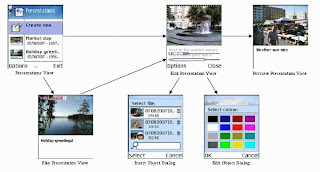
As you can see, basically we will rotate between toolbars, palettes, and the picture on the mobile device. For example, the top left image is our video. Top right is the screen where we can add sound. The bottom left screen is where we have an object added to the video and we can drag it around and such and place it on the video. The bottom right is where we can add in frames. So to handle the smaller screen for the interface, we have many different pages we can scroll through to perform many different actions. This is a great solution to do work on a small screen while at the same time retaining all of the features.
Thursday, February 26, 2009
The Design of Future Things
I liked this book because it made things seem like reality that I've always dreamed about having. For example, when I was 9 I read an article about a new car that would drive itself, traveling down the road at 180 MPH. I wondered about this and then saw an example on Minority Report, I thought it was pretty cool. But Norman does a good job of telling me that not everything that glitters is gold; there are problems.
He also did a good job of letting us know of interesting ideas that will be more annoying than good, such as the automatic house. If the house sees you going to bed, it will turn off the light, turn the air down etc. But this isn't always good; what if I were just laying down and not going to sleep? What if I wanted to read a book? And if I were making eggs for a friend (and you KNOW it would deny me eggs), it wouldn't let me get eggs because my weight is not good. I always thought these futuristic devices were good, but the book did a good job of letting me know it ISN'T all good. Also, it gave me good insight about automation, and not to use too much.
Tuesday, February 24, 2009
Video Annotations, Navigations, and Video-Still Composition
Videos use all kinds of technology today to make viewing more enjoyable. Annotations, Navigation, and Video-Still Composites are some of the most enjoyed luxuries. Dr. Dan Goldman proposes ways to improve all of them.
Video Annotations
Annotations are what make viewing easier and understandable. You see it every day: When watching a sporting telecaster draw motion, on youtube when a bubble pops up to describe what's going on, when you see thought bubbles on TV. John Madden made famous the idea of drawing routes receivers run, where a runningback goes, where a blocker takes his angle. Now, everyone uses it. You see it in tennis matches tracking the path of the ball, basketball, everything. On youtube, the video annotator allows the uploader of a video to add subtitles, speech bubbles, and other things.
Video Navigation
If you use VLC Media Player, Real Player, Windows Media Player, ANYTHING, you see a line that is start to finish. There is a timeline going through the movie with a marker letting the user know where they are in relation to the start and end of the video. They can drag the marker to a point on the timeline and the movie will jump to that point, as happens on any youtube video.
Video-Still Composition
We think of videos as compositions of many different frames which, when put together one after the other, form a seemless video. The problem comes when we take one still image; we can see tons of motion. Nowadays, cameras come with a burst function which take 2 to 10 images in a row, great technology.
Particle Grouping Approach
The approach of Dr. Goldman is particle grouping approach of Sand and Teller. It takes still images, and makes different particle groups based on what's in the picture, and is able to do many things with the particles, such as annotations of motions, graffiti, etc.
In this picture, as you can tell, it is divided into sections of particles which separate the two kids walking through the woods, and the woods themselves. Using some very complicated algorithms that I didn't really understand, we can do things such as annotate images with motions of the paths they take. For example, take the picture below:
If we make number 37 based on his particles, the video will automatically draw the path of motion he takes when we play it. There are other video annotations and navigations we can use such as graffiti where we would change his number from 37 to 3 and then can play the video, using the particles, as him being number 3, not 37. And we can navigate based on when he is at a certain point in the video. We can choose when number 37 is around the line of scrimmage and it will skip to that point in the movie, not when he is receiving the handoff 4 yards deep.
Monday, February 16, 2009
The Mole People
The Mole People was an interesting book to say the least. I thought it would be about the people who use the subways and how they act. My ethnography was about people riding the bus on the A&M campus. I thought this would be about those riding subways, not those living in old abandoned tunnels.
The stories were interesting yet exciting at some points. They were depressing at points, but not always. It was interesting to think that these people who are very smart and could be engineers are living down in the tunnels. It also makes me feel a little safer that we don't have subways as there are in New York City. I would feel frightened to go down there due to fear of muggings, being on a train that sees someone get run over, etc. It was also interesting to compare and contrast those who live in subways to homeless who live in San Antonio for instance. They just duck into entryways of stores for the most part.
I really liked the book, although it was a completely different ethnography than I was expecting, and different from what I did. This was more quality while mine was quantitative.
Thursday, February 12, 2009
The Media Equation
I read the book, and it was very interesting. For the most part, they took everyday actions and emotions of people how they react to other people. Then they took these and found out if humans treated media (mainly computers) the same way. For the most part, they did. It was very interesting because I think I knew this, but never really considered testing it.
The book was easy to read and made perfect sense. When I thought about what the book was saying, I found that I was the same way as the people in the tests. I would curse the computer and not the programmer. When I read a book recently, Wilt, 1962, there was criticism on the front cover from H.G. "Buzz" Bissinger, the author of Friday Night Lights. It wasn't from someone who knows nothing about sports, it was from an author who supposedly knows a lot about sports. The tests were good, but sometimes I wondered about the sample size and if the tests were really good. But for the most part, they were, and things like gender wouldn't matter.
Wednesday, January 28, 2009
The Design of Everday Things (pt. 2)
I've always been a fan of NCAA Football for the PlayStation 2 and now the Xbox 360. I played NCAA 02 on PlayStation 2 my freshman year of high school when I joined the football team. I played against my fellow teammates through 2005 (when I graduated) and in 2007 I got an Xbox 360 so I bought my first NCAA game (2008) on it when it came out that summer. The main problem I've had has been with the interface on the playcall screen.
The PlayStation 2 version looked like this:
Basically, after selecting a formation, you are given multiple "pages". On each page, you can press a button to select a play. You scroll through the "pages" using the control pad and can press the other unused button (triangle) to go back and pick a different formation. I got used to this after playing for 6 years. Also, if you wanted to make a different "package" (for example, use a receiver at the tight end position for just one play), you could press right when you're selecting a formation. But when I made the transition to 360, it looks like this:
Basically, you now have to highlight a play (and then press the A button) to select it. Of course, if you press another button (in the picture above, Y or RB), it will select a that certain play. To scroll from "page to page", you have to have to move the stick the direction of that border. For example, if I wanted to move to the right, I'd have to highlight PA TE Flood or Curl Combo in the picture above and THEN press right, so it takes TWO presses of a button. I've received a few Delay of Game calls because it takes so long to browse. It took me a while to figure it out (the instruction manual for the game is a joke) how to switch packages as well. On this scree, you have to use the RIGHT analog stick and that will scroll through the different packages.
EA Sports still makes an NCAA game for PS2, and the playcall screen is the same as it always has been. So when I play a friend who doesn't have a 360, I am lost because I've been used to using the XBox 360 format for the past 2 years. Even though it is a better format, I've grown accustomed to using the bad version (even though I'm not good at it), so I'm not used to it.
The book made me think of this; the more information, the more difficult it becomes to design an interface for it. And when something releases a new version, it's not always BETTER. In fact, it can regress over time. This is a perfect example/
The Design of Everday Things (pt. 1)
So I just read a book (over the course of 5 days since I joined the class late and only started on Friday since I had to go buy the book and the bookstores were closed Thursday when I found out about the assignment) called The Design of Everyday Things by Don Norman. While it is slightly outdated (written in the late 80s), there were many points that I agreed with which also made me wonder why CAN'T things be like he said? He gives examples of poor design, explains why they are poor design, and sometimes proposes better plans. For example, every stove I've ever seen is what I call "four corners", and EVERY time, I have to look at it before turning on a burner. Meanwhile, they COULD be lined up in a row with their buttons in the same order, and it would be perfect. Why not?!
Another example was the buttons in a car. My driver's side control has all SORTS of buttons. There is a trigger for moving the seat forward and back, the back rest forward and back, the seat up and down, to tilt the seat forward, etc. I can NEVER remember what button does what and always have to test them as I go to see. However, Norman proposed a design where the button looks like the seat and the way you push it is the way the seat moves, leans, tilts, etc. I always just dealt with such things because I figured there was nothing better (since designers would have made them if something DID exist), but now I'm almost not happy with what I have.
Another thing it did was to make me feel better about mistakes I make and gave me the right words to tell people when THEY make mistakes. At work (doing IT for the athletic department), I see people get discouraged and frustrated when they make a mistake. I've tried to tell them that it happens to everyone, but it's hard to get that point across. Now I can tell them flaws in the design which lead to such mistakes and hopefully they will feel better. The book is very good, quick and easy reading (I guess it isn't TOO quick because I spent quite a bit of time to get it read on time), and fun to read.
Subscribe to:
Posts (Atom)